Logos And Animation
Logos Require Understanding
The art of a good logo fascinates me. Every brand, by the nature of being in a competitive enviroment surrounded by other brands, needs to stand out in some way. I think it’s more accurate to describe brands as personalities, with unique traits and features that need to be expressed in their presentation. This is why branding, and logos in particular, are so important to ones business.
Animation Accentuates Character
Animation is a fantastic tool to deliver a message about a brand in an eye catching visual. I love this element of the design process. Finding a fit for a brand is like completing a puzzle, it’s rewarding and satisfying.
For example, my Newman Workshop logo features a forwards wind button, but also the initials of ‘NW’, to stamp my brand but also indicate that I work in videography and film.
I made two different logos in After Effects based on JRN Media’s aperture logo. As a media company, the focus on quality and smoothness is of upmost neccessity. Media companies need to see the quality immediately, and anything sub-par stands out. I made multiple versions of these logos.
HighDive Apparel
I worked with Highdive Apparel to create a Birthday promotional video. While there logo was already created, I felt it would benefit some animation for the video. I did this through Adobe After Effects 2025.
A Modern Japanese Restaurant
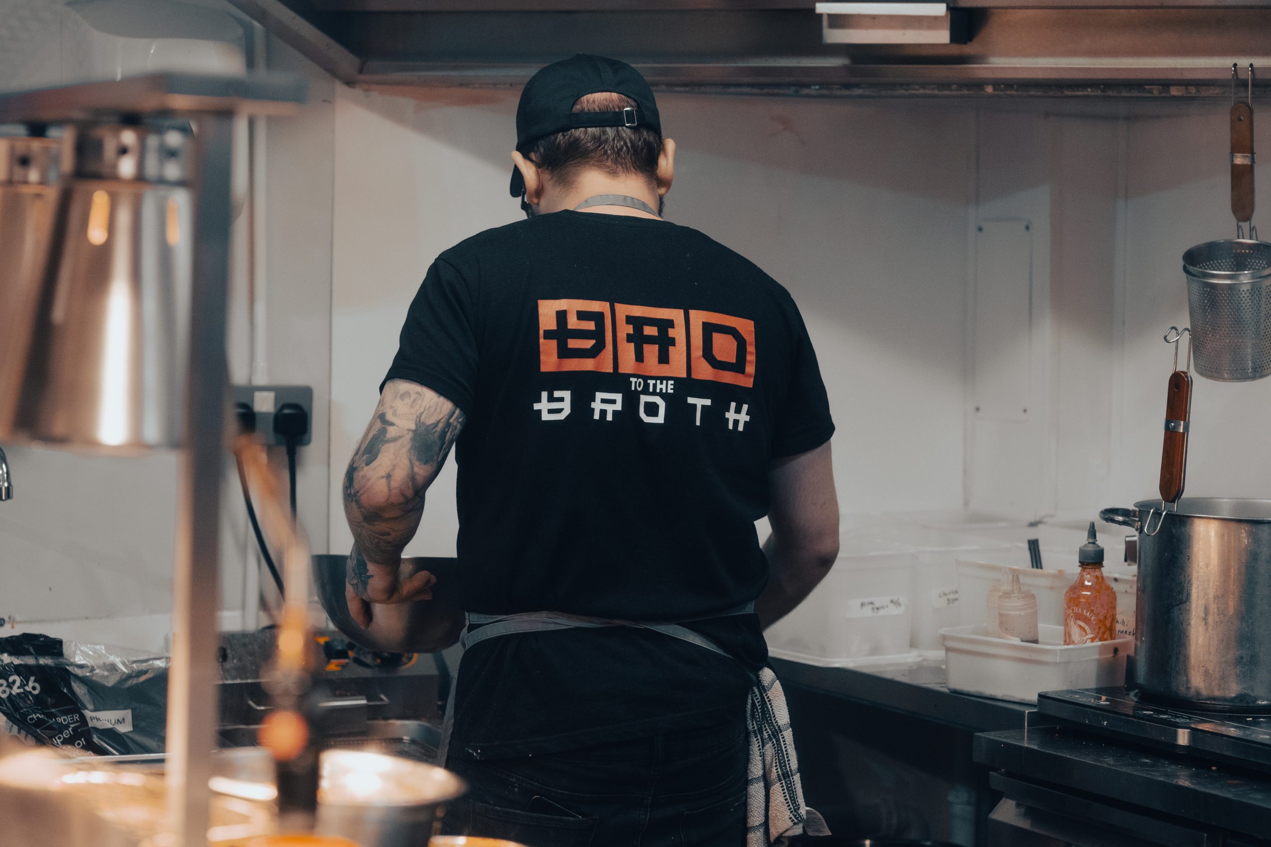
Bao To The Broth was an interesting project. Bao wanted to remain friendly and down to earth while still presenting their brand as a professional setting. Working in the food industry requires a level of professionalism, especially considering food handleing and hygiene standards.
For the logo design, I animated their prior logos to add some flair and present the brand as modern and sharp. I believed a brand with a that focused on angles and geometry intergrated within the prior brand style while adding a level of professionalism to the company.
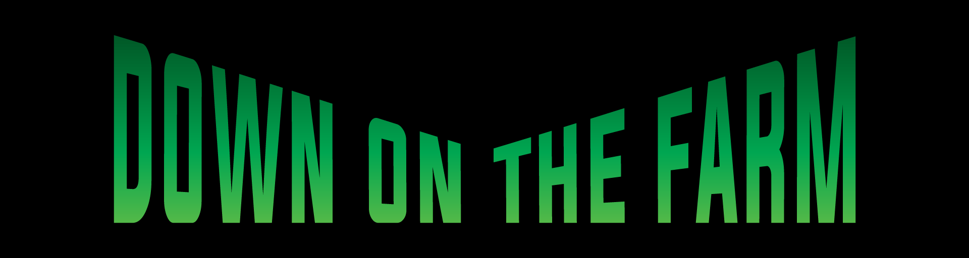

Down On The Farm 2024:
As a practice piece I remade Down On The Farms Logo. I wanted to keep the farm theme while modernising the logo, so I used the classic farmland illustration with grass leaves to form an arrow, playing on the “Down” in “Down on the Farm.
I made a number of alternate and test designs to come to this final product, which you can see below.